UX Grocery Case Study
The product:
The app is designed to help busy individuals make quick and informed food-related decisions. Whether they are short on time to cook, looking to explore new restaurant dishes, or needing assistance with grocery shopping, the app streamlines the decision-making process by offering recommendations, reviews, and seamless navigation.
The Problem
Grocery delivery provides convenience, saves time, and reduces food waste. However, many users struggle with choosing the right products, navigating overwhelming options, and trusting online descriptions. The app addresses these issues by offering tailored recommendations, product reviews, and meal-planning assistance.
The goal
An app was designed for busy grocery shoppers that suggests quick recipes based on preferences or pantry items, creates dynamic shopping lists, highlights deals, and offers in-store navigation or delivery options. Simple, fast, and stress-free meal planning!
My Role
UX Engineer
As a UX Engineer, I bridged the gap between design and development by transforming ideas into functional, user-friendly interfaces. Utilizing tools like Figma for design and React for front-end development, I ensured a seamless and accessible digital experience.
Responsibilities:
User research, wireframing, rapid prototyping, conduct a usability study, low and high fidelity prototyping, accounting for accessibility, and iterating on designs.
Understanding
the user
● User research
● Personas
● Problem statements
● User journey maps
User research: summary
To better understand the needs of potential users, I created empathy maps that revealed valuable insights. It became evident that busy working professionals with demanding schedules and little time for meal preparation could greatly benefit from this app. This target audience often struggles with making quick decisions when it comes to dining options, and the app aims to alleviate this challenge by
simplifying their experience.
User groups emphasized the importance of having an app specifically designed to review restaurant dishes, saving valuable time during mealtime. Instead of being overwhelmed by a menu with enticing options, users could simply open the app, locate the restaurant, and explore reviews for specific dishes they’re considering. This functionality enables informed, snap decisions, ensuring users can confidently choose their meals without hesitation.
User research: pain points
- Time :- Working adults can be too busy to order grocery's and meal prep for themselves.
- Frustration :- Grocery shopping can feel like choosing from an overwhelming menu. An app could simplify decisions by offering reviews or ratings for products, helping shoppers confidently pick the right items without hesitation.
- Annoyance :- With grocery delivery, a brief description of a product often isn’t enough to decide if it’s worth trying. An app could help by offering detailed reviews or ratings, giving you confidence in selecting new foods without second-guessing.
Persona: Ashley
Problem statement:
Ashley is a full-time mother of 3 and works full time who needs help getting food because she doesn’t always have time to meal prep in between family and work
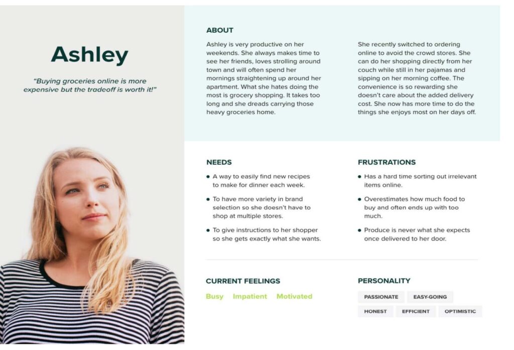

User journey map
Mapping for Ashley’s user journey revealed that having an app to help make decisions on what products to order/deliver is an important help aid with a busy family and career
Starting
the design
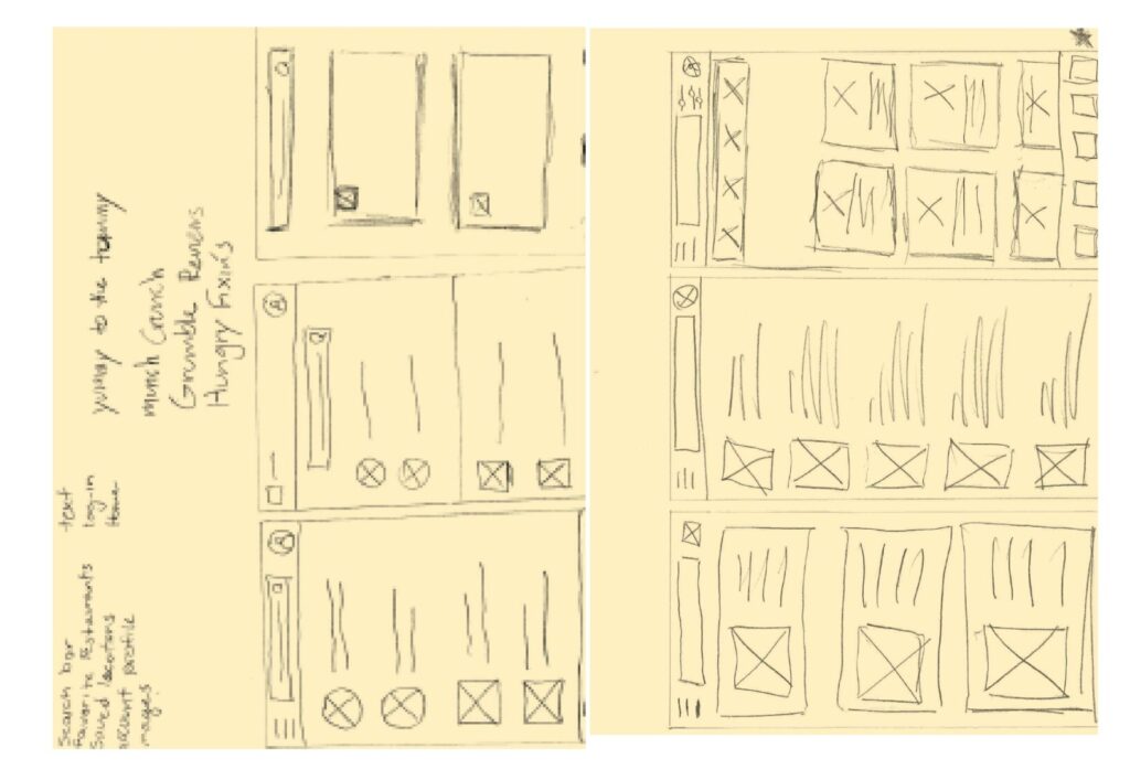
Paper wireframes
Creating paper wireframe to see what designs would work and what wouldn’t work. Some of these ideas ended up become digital wireframes.

Digital wireframes
The goal was to keep the home page is easily accessible to your favorite food items and to new food items not tried yet.
Digital wireframes
Easy navigation was the main focus for the app
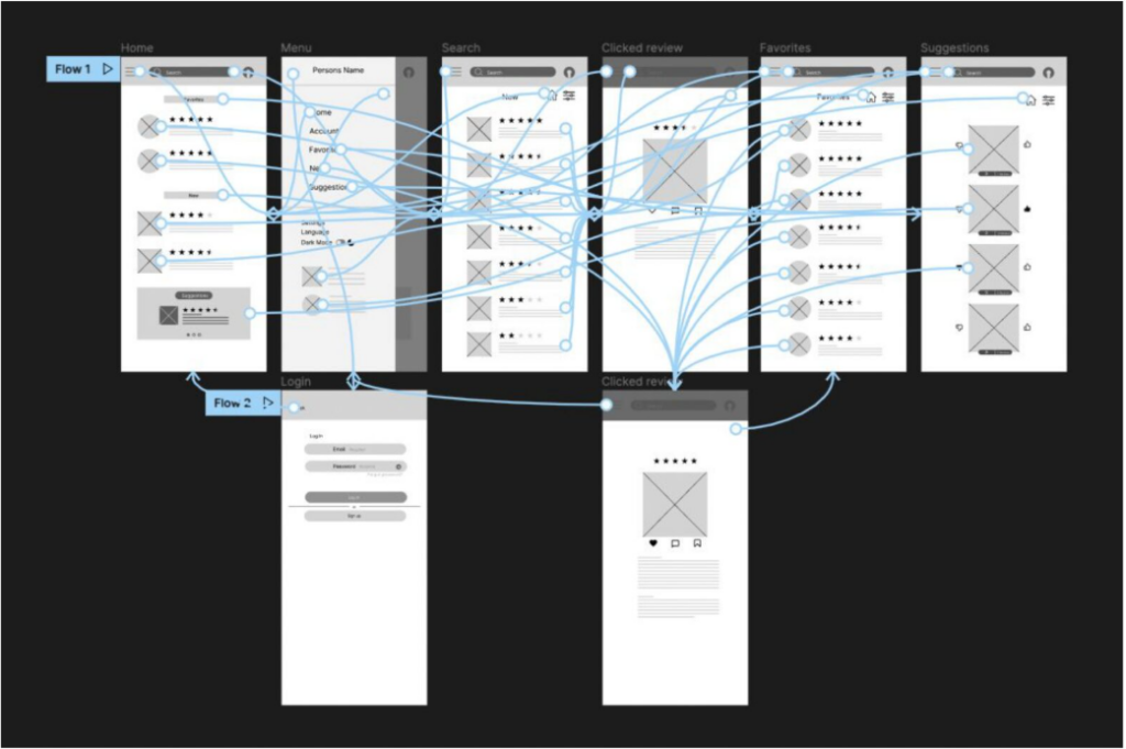
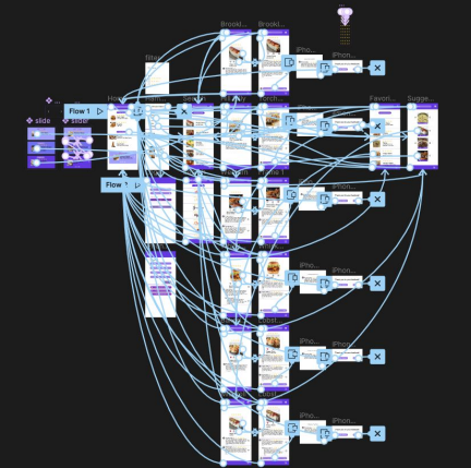
Low-fidelity prototype
The low-fidelity prototype with connections for users to follow during a usability study.
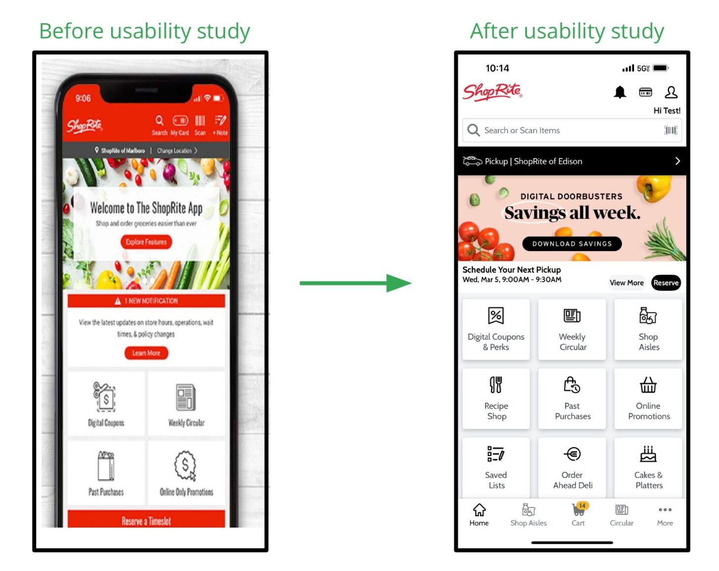
Usability study: findings
I conducted two rounds of usability studies to refine my design. The first user study helped with finding bugs and bad decision making. The seconds user study helped with really narrowing down the final product to something more refined.
-
Round 1 findings
- 1:- User liked easy navigation
- 2:- Users liked to the card approach
- 3:- Most users wanted faster navigations
-
Round 2 findings
- 1:- Users liked a physical back button
- 2:- The suggestion box become even more developed.
Refining
the design
● Mockups
● High-fidelity prototype
● Accessibility
Mockups
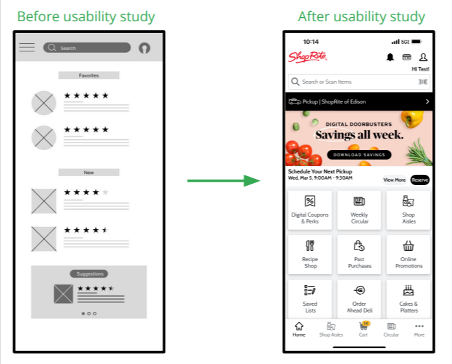
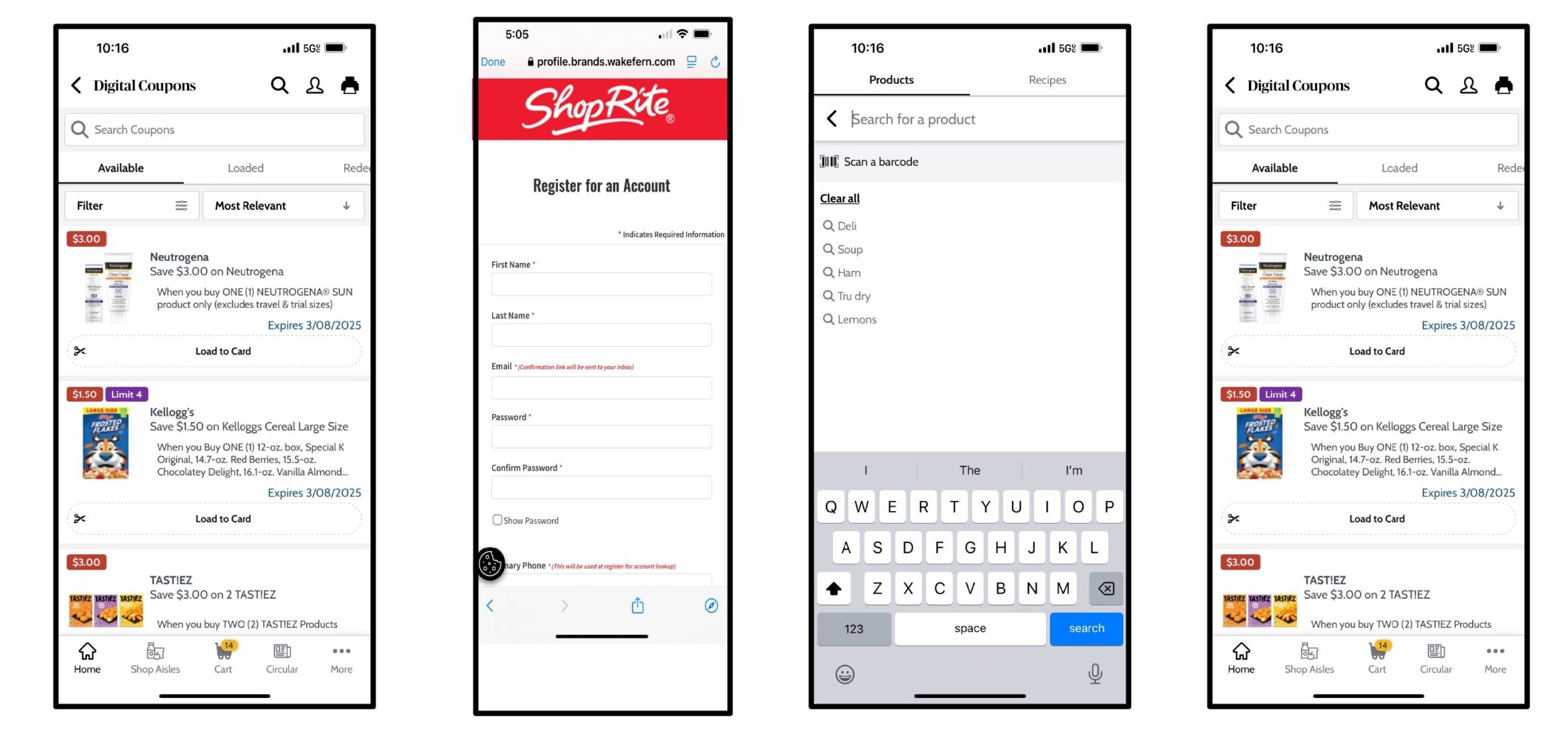
For the most part this screen ended up not changing much between the two user studies because of how much the users enjoyed the layout of the cards.
The second user study showed some frustration with the suggestion box not being interactive, you can now view the three different suggestions given.
High-fidelity prototypes
My high-fidelity prototype designs are still in use throughout the IOS & Android application.
-
Accessibility considerations
- 1:- Made sure to have easy navigation flow.
- 2:- Used icons to help the users navigate easier.
- 3:- Provided button colors, image text, alt tags, and info text for JAWS & Bobby readers.
Going
forward
● Takeaways
● Next steps
-
Takeaways
- Takeaways:The hope is that this app will help grocery users make snapper decisions for food pickup or delivery under pressure. One quote from a user study: “The whole app makes sense and seem to function well.” The majority enjoyed the easy flow of the app.
- What I learned :- User studies are a huge help with refining a product to something more worth wild. They give great feedback on how to make something better.
-
Next steps
- 1:Proceed with another user study to evaluate whether my final design decisions have achieved a greater impact.
- 2 :- I'd like to focus on improving areas where I see potential, aiming to make them even sleeker and more refined.
-
Let’s connect!
- Thank you for viewing and reading my case study
- Name: David Acquaviva
- Email: [email protected]